


Keeping your website visitors informed about news in your company or in the business, in general, is a very important thing. That’s why having a blog on your website is a beneficial thing. Most recent posts section makes fresh information easily accessible to your visitors.
Divi already has a built-in module called Blog Module. With a few tweaks and a little bit of CSS, your recent post section can really come to life. In this article, I’m going to guide you through each step of creating recent post section same as one on the Glimmernet Technologies website.
First, we need to pick the page where we want to display our recent posts. We add the section and the row with as many columns we like. On our website, we decided to show four most recent posts so we went with four column row.
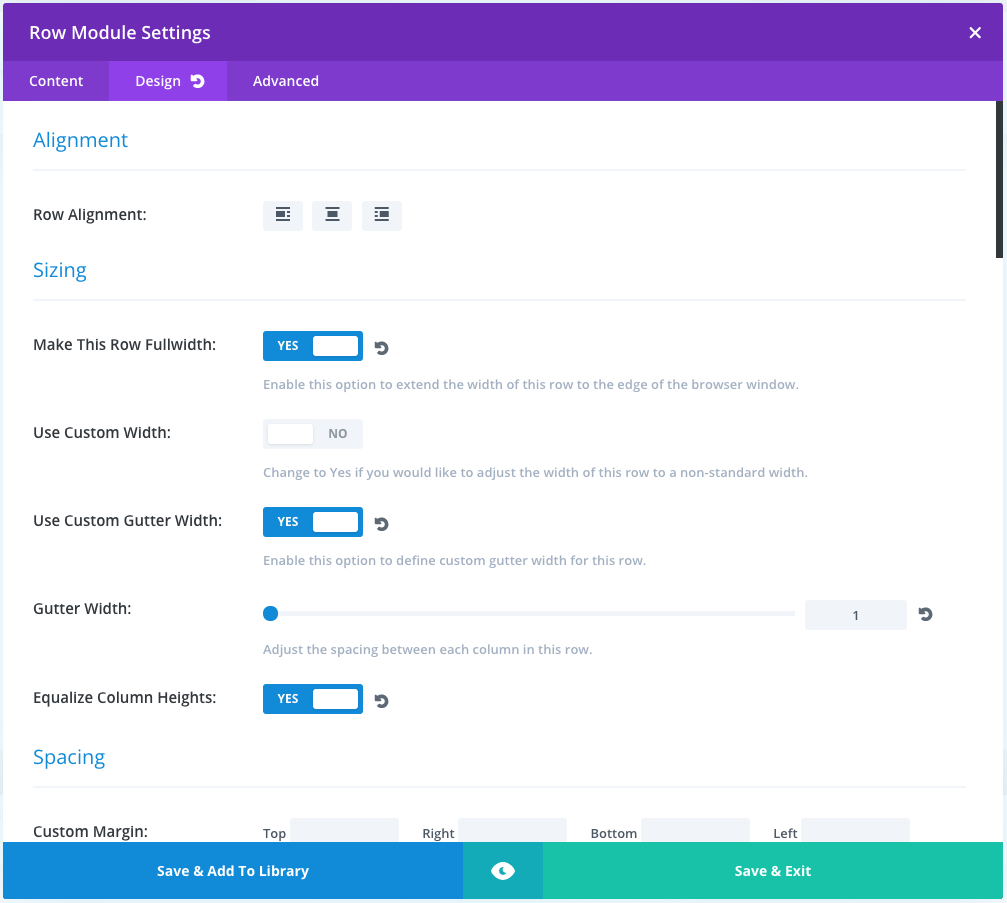
Row Module settings
After that, we want to set up our Row Module settings. We open the settings for our Row module and in Design tab, we want to turn on following options: Make This Row Fullwidth, Use Custom Gutter Width and Equalize Column Heights.
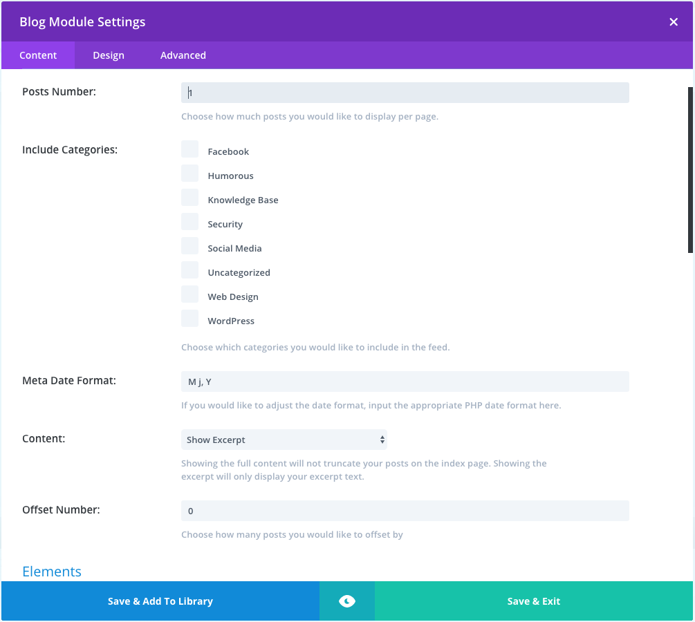
Blog Module Settings
Content
In each column, we want to add Divi’s Blog Module which shows only one post, so we set Posts Number to 1. Offset Number for the first module is set to 0, on the second to 1, third is set to 2 and the fourth to 3.
In the Elements section of the Blog Module Setting only Show Featured Image option should be turned on.
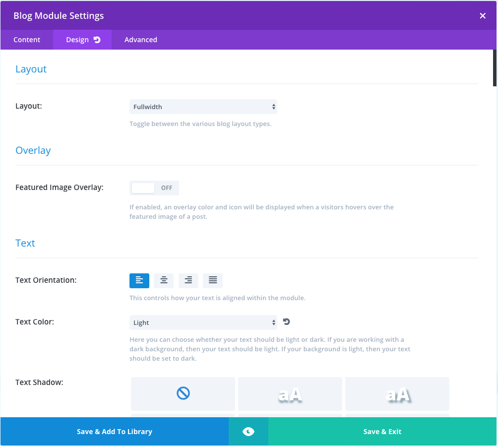
Design
In the Design tab, we need to set Layout to Fullwidth, text orientation to left, text color to light, h2 title size and body text size to 17px and 14px respectively. Rest of the settings we can leave on default values.
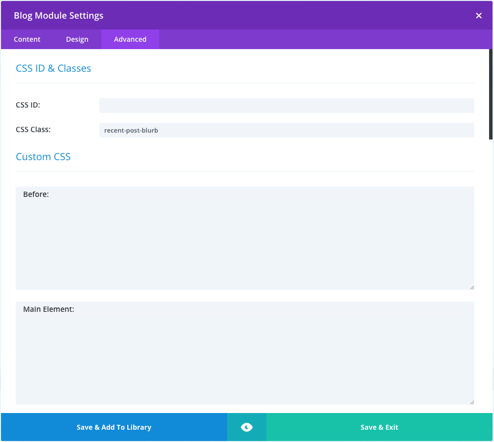
Advanced
After that in the Advanced tab for each Blog Module, we add class name recent-post-blurb. This CSS class is going to allow us to reference our code to these specific modules. Now we just need to add the following code to our CSS file:
|
1 2 3 4 5 6 7 8 9 10 11 12 13 14 15 16 17 18 19 20 21 22 23 24 25 26 27 28 29 30 31 32 33 34 |
.recent-post-blurb{ position: relative; overflow: hidden; } .recent-post-blurb article{ margin-bottom: 0; } .recent-post-blurb .post-content{ display: none; } .recent-post-blurb .entry-title{ padding-bottom: 0; } .recent-post-blurb .entry-featured-image-url{ margin-bottom: 0; } .recent-post-blurb:hover .post-content { display: block; position: absolute; bottom: 0; padding: 10px; } .recent-post-blurb .entry-title a{ position: absolute; bottom: 0; padding: 10px; width: 100%; background-color: rgba(0, 0, 0, 0.8); min-height: 20%; transition: min-height .3s ease-in-out; } .recent-post-blurb:hover .entry-title a{ min-height: 100%; } |
This code moves title over the featured image and hides post excerpt in the default state. Once we hover over the one of the posts title height is going to 100% and an excerpt is shown.
Depending on your setup you can use media queries to hide excerpt on certain screen sizes.
If this helped or if you have any questions, leave us a comment below!
1 Comment
Every featured post box is actually a grid by design. Article thumbnails fit together either symmetrically or asymmetrically to offer visitors the most intriguing or recent headlines. But how the grid is designed can make a big difference in user experience.