


Understanding the anatomy of a webpage is essential for creating a site that looks great, functions smoothly, and delivers results. Our interactive image map highlights the key components of a modern website layout — including the header, logo, navigation, hero section, content areas, call-to-actions, and footer.
Whether you’re starting from scratch or planning a redesign, this guide helps you visualize how each part contributes to a successful digital experience.
At Glimmernet, we bring structure to strategy through tailored services like WordPress website design, eCommerce website design, and website maintenance. We also offer managed WordPress hosting to ensure fast, secure performance, and privacy policy solutions that help keep your site compliant.
Explore the image map below to see how these elements work together — then reach out to see how we can help you build something better.
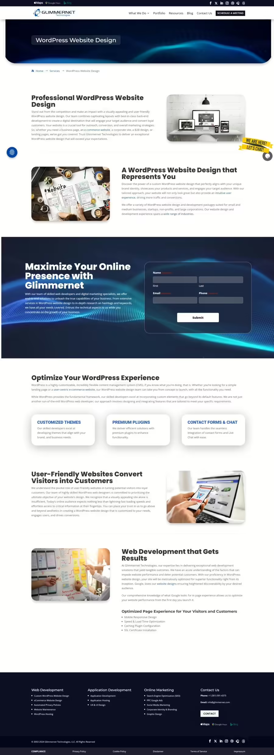
Logo or Site Name
Primary Menu
Secondary Menu
Breadcrumbs
Page Title
This screenshot doesn't show one, but a subtitle is also a great addition to tell the users (and the search engines) what the page is all about.
Banner Image
Privacy Policy Widget
This widget stays pinned to the bottom of the screen as the user scrolls.
Live Chat
Live chat can help you swiftly turn visitors into customers and provide stellar support for existing ones, but there can be a downside of implementing chat on your website if you're not prepared.
Call To Action Section
Footer
Footer Menu
Copyright Statement
Did you know you can copyright the design of your site with the US Patent & Trademark Office?
Social Media Links
Privacy Policy Links
Some of this is required by law!
0 Comments